

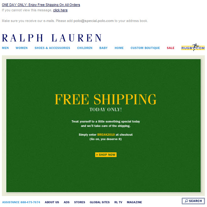
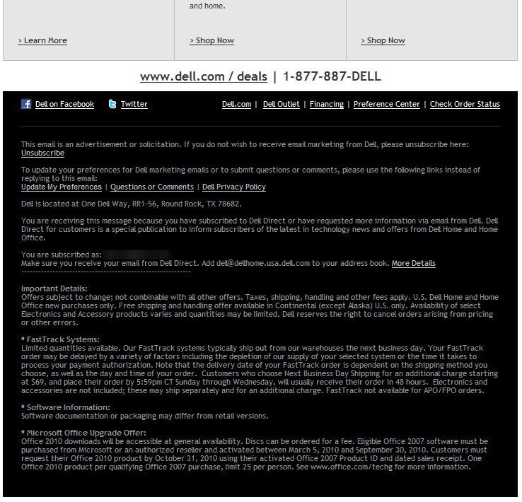
The Boomer generation is a critical audience for marketers. By 2015, those aged 50 and older will represent 45% of the U.S. population, according to AARP. And currently, Baby Boomers control over 80% of personal financial assets and more than 50% of discretionary spending power, according to ThirdAge. However, marketers regularly use small text on their Web sites and in their emails and other marketing materials, creating unnecessary legibility issues for some of their most valuable customers. Speaking at the Forrester's Marketing Forum 2010, an executive from financial services company TIA-CREF said it asked its community how to improve its Web site. The #1 response was "bigger font." Not considering the needs of Boomers when designing marketing materials means lost revenue for marketers and a poor user experience for many Boomers -- not to mention other visually challenged people like myself. To help address this issue, I've created the Boomer Legibility Initiative for a New Decade (BLIND), which seeks to convince marketers to increase the point size of their fonts by 1 point this year, in 2015, and in 2020, to make it easier for the growing Boomer population to read and take advantage of their offers. The problem is particularly evident in marketing emails. Even brands that skew older like Nordstrom (see example) and Ralph Lauren (see example) use overly small fonts. And the problem is worse when you look at administrative text at the bottom of emails. Sixty-four percent of retailers use an 8-point font size or smaller for their admin text, which includes critical information such as unsubscribe and "change your address" links. For retailers, this fine print often includes sale exclusions. Do they really not want their customers to be able to see which brands, etc. are excluded from a sale? That's a recipe for a poor customer experience. Increasing font sizes is also becoming vital as more email and Web sites are viewed on mobile devices, which often scale content down, making text even harder to read. So this is an issue about reaching both Boomers and mobile customers. Other Readability Issues In addition to making fonts larger, there are a number of text treatments and design elements that also reduce the legibility of text: 1. Reverse type, where there's white/light text on black/dark background. Dell does this for its preheader and administrative text (see example). 2. Low-contrast text, where text and background colors are very close in value to each other. Coldwater Creek does this in this email, which uses a sun-dappled font color. 3. Text over background images with lots of bright and dark areas. 4. Full caps, which are not only considered shouting, but are harder to read than sentence case, where you capitalize the first word of a sentence and any proper nouns. Coach does this excessively (see example). Have you made any recent changes to your design to make them more legible? Are there marketers that you wish would make their emails easier to read?