Commentary
Obama vs Romney: Winning The Hearts & Email Addresses Of America - Part II
- by Casey Swanton , November 5, 2012
In my last posting, I outlined several customer-centric themes that can improve the user experience during the email opt-in process, in turn, increasing the overall subscriber acquisition rate. For many marketers, the opt-in path comes to an abrupt end when the subscriber either opts-in or abandons the page. While this seems like a natural termination point, there are still opportunities to contribute to a positive user experience. By mapping out an intuitive and strategic user path from this point on, a new subscriber is more likely take a deeper dive into your site content. Additionally, a hesitant subscriber may find new reasons to opt-in. Similar to my last post, the best practice themes that I cover in this post will be framed against the Barak Obama’s and Mitt Romney’s opt-in pages and the associated user paths.
Don’t abandon your subscribers (or your prospects).
Regardless of whether a visitor to your site completes your opt-in forms or decides to jump ship before clicking the submit button, it’s important to give them plenty of opportunities to explore your site’s content pages. All too often, opt-in forms and subscription confirmation pages fall short in providing meaningful and engaging options or next steps for page visitors. If visitors can’t spot an easy next step to jump back into your site content, they’re much more likely to head for the home button or their browser’s search bar.
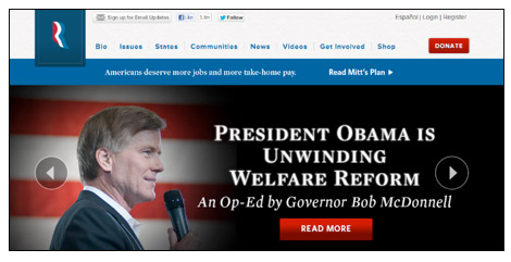
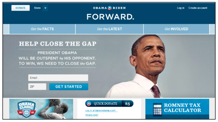
Upon landing on the Romney campaign donation page, I had the option to either complete the contribution form or explore the rest of the site by linking through the prominent navigation bar that is consistent across all mail website pages. In contrast, the only way to make my way onto the Obama campaign home page was to click through the campaign logo on the header, which fortunately was a live link. While this was a functional work-around, it isn’t terribly intuitive or motivating. Due to this oversight, it’s likely that quite a few subscribers gave up and exited the page by clicking through to their browser’s home page as opposed to clicking through to more of the Obama campaign’s site content. By offering a clear path for interaction and exploration such as a navigation bar, the Obama campaign could have given site visitors the opportunity to learn more about the campaign before committing to a donation.

Instead of ignoring this “next steps” opportunity, add information and calls to action to your opt-in confirmation page so these new subscribers can explore more of your content. Additionally, be careful not to funnel site visitors into an opt-in page that doesn’t have an easy way out. Even if they don’t opt-in right away, you’re much more likely to salvage the opt-in if these visitors are able to easily explore other areas of the website.
Don’t miss out on other opportunities to connect.
Oftentimes, a site visitor needs to do a little browsing on a website before they’re willing to invite a brand to their inbox. By only using a homepage opt-in, your brand may be missing out on the opportunity to engage subscribers once they’ve gotten more perspective on your company or offering. Make sure that your content pages offer a link to the opt-in page or simple opt-in form. Additionally, an email opt-in that is framed in relation to subject matter on the content page can further increase the likelihood that a potential subscriber will find it meaningful and motivating.
Illustrating this best practice, earlier iterations of the Romney campaign’s site pages featured a subtle, but clear call-out to sign up for email updates and/or donate within the navigation bar. Additionally, the majority of the site’s pages offered different opportunities to join the email list or get involved via social media sites.

While the Obama campaign site appears to have a strong social media strategy in place, much improvement can be made to leverage content pages to acquire additional subscribers. Many of the opportunities to enter an email address are framed in terms of standing up for particular campaign issue, donating or creating an account. While each of these items may be top priorities for the campaign, the Obama camp may be unintentionally alienating visitors and losing a second chance to engage visitors who are seeking more information. While present, I had to do a considerable amount of digging before I found a place to opt-in to receive information and campaign updates via email.

By adding a link to an opt-in page or even simple opt-in form to consistent elements of your website such as the footer, header or sidebar, you’ll likely see additional opt-ins being captured from your content pages. Adding targeted call-outs for your email program within relevant sections of body copy can take your email acquisition efforts to the next level. For example, if your emails program includes exclusive offers, add an opt-in form to the “Specials” page of your site. Similarly, if email content includes additional information and tips about your products, add an opt-in option to pages where site visitors are already taking a deeper dive or learning more.
So what is the take-away?
Updating your email opt-in process to be more accessible, subscriber-centric and user friendly can make a major impact on the number of site visitors who successfully subscribe. Additionally, opt-in page visitors should be recognized as the valuable and engaged group that they are. Whether they chose to complete their email subscription or abandon, be sure to give them plenty of options (and reasons) to remain on your website.


