airlines
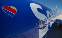
Southwest Airlines Launches New Look
- by Tanya Gazdik , September 9, 2014

Southwest Airlines is launching a new brand experience, including a redesigned logo, inflight materials and magazine, and a revamped appearance both online and at the airports.
An advertising campaign will inform customers about the new look. The initial effort broke Monday with a commercial unveiling the new plane design themed, "Without a heart, it's just a machine."
The second phase will launch in early October and will focus on its employees' hospitality. It will include a new tagline.
The airline collaborated with a range of agency partners. Lippincott led the brand identity refresh, GSD&M led the advertising campaign, Razorfish led the new digital experience, Camelot led the media placement and VML led the digital advertising.
Every time people see the Southwest heart design, there’s an opportunity to infuse it with meaning, said Lara Bridger, group creative director at GSD&M.
advertisement
advertisement
“Our job was to crystalize the personality and voice of the brand so that you feel Southwest’s humanity even when you’re not having a one-on-one interaction,” Bridger says in a release. “Whether it’s a peanut pack or a TV spot, every communication must give the heart dimension with smarts, humor, and the bold spirit of the brand.”
The redesign was unveiled Monday with the display of a new aircraft livery, named Heart One. Southwest Airlines and its partners did comprehensive research and held numerous focus groups with employees and customers to determine how best to create the new look.
The airline heard that it was important to remain unique and to retain its personality; for these reasons, Southwest continues to use the vibrant color palate and striped tail that has long identified the carrier, while adding a modern touch, proudly displaying the Southwest name on the side of the fuselage and presenting the heart on the aircraft belly.


The change in the looks of Southwest airlines could help them in bringing in more people. The heart symbol does give off a comforting feeling, but they also have to display that with the actions they make as a company as well as the employees. The one thing that would portray a better image would be actions instead of pictures and words. The look would be the start to display change to the community and people would be looking at Southwest Airlines and the things they do.
One thing to wonder is what they will be changing within the company to portray to the people of a heart warming feeling. By change I mean a change in their actions or what they do on a daily basis towards customers. The one thing about Southwest airlines that they are good at standing out with the colors they use. This new design is a great image for Southwest Airlines especially for the way they portray the company as very welcoming. One thing that I believe might really help them out is targeting the elderly. The reason I say this is because if you make your company comfortable and easier for the elderly anyone would be able to adjust to it. Technology wouldn't be an issue because of how advance everything is in society.
Well done Southwest! A branding campaign that goes far beyond marks and graphics and embodies the spirit of the company. Now, if they could just go back to having the lowest prices...sigh!