Commentary
Lincoln's 'Mad Men'-Era Ad Phones In A Contemporary Touch
- by Steve Smith , Staff Writer @popeyesm, March 23, 2012
 In the new, marvelously creative “Heritage” issue of Newsweek, even the advertisers were recruited into the retro act.
Commemorating the return of the "Mad Men" series this Sunday night, the magazine recreated its mid-sixties look and feel throughout. The entire magazine was rendered to seem like it was sitting on a
1965-era coffee table. Advertisers in the issue were likewise charged with crafting ads that look as if they could have been in a circa-60s news magazine. For the curious, all of the retro ads are
collected at Newsweek/Daily Beast’s site for voting.
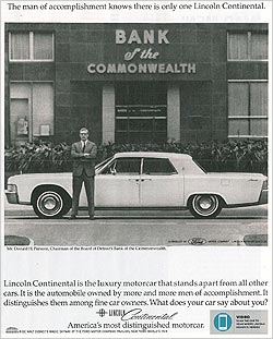
Many of the advertisers remained true to the mission, recreating faded colors and straightforward layouts, typefaces and images that invoked a different age. And some even found a way to slip in a more modern URL to ensure they got some interactive mileage out of the project. Automaker Lincoln used mobile technology to allow the ad creative to stay true to its time -- but its messaging extends into new media interactivity.
The ad itself was a mottled and slightly fuzzy black-and-white image of a vintage Lincoln in front of the Detroit Bank of the Commonwealth and its Chairman Donald H. Parsons. (To keep in tune with the times, there was even a small callout reminding people to ride the Disney Magic Skyway at the New York World’s Fair of 1964). But the ad unit also calls out the user to scan the ad with the Digimarc Discover app to get further video. It was the only ad we could find in the magazine that has this mobilized element.
Digimarc uses watermarking to encode the image without perceptibly impeding it in the way that QR codes or other scan codes may noticeably interrupt the flow of the design. Of course, the users still need some visual prompt to alert them to the presence of a watermark that can be scanned.
In this case, the result is a two-minute video of Lincoln Design Director Max Wolff discussing the nature of mid-sixties design. While probably longer than I would like, the payoff here is better than most mobile scanning projects that we still see in this maturing market. The content at least is interesting (well, for about a minute), and it offers a creative modernizing of the retro ad.
While this was a case where the mobile coding provider worked directly with the brand, the watermarking approach seems to be getting some traction among magazine publishers in recent months. From the days of the original CueCat (anyone remember that?) publishers loved the idea of linking print to digital, but they hated the hit it exacted on design. House Beautiful, SHAPE, Lucky, Sports Illustrated and others have all had ads or their own editorial or their advertisers using the model. We surely will see more of it this coming year, as people in the magazine industry have been telling me.


