
January 25, 2023

Amobee Analyzes Online Metrics, As Political News Becomes More Interactive
- by Philip Rosenstein , February 9, 2016
 The
eventful 2016 race has increased traffic on many political news sites. Many of the big names -- CNN, Politico and The Washington Post, among others -- have launched interactive 2016
campaign dashboards.
The
eventful 2016 race has increased traffic on many political news sites. Many of the big names -- CNN, Politico and The Washington Post, among others -- have launched interactive 2016
campaign dashboards.
Amobee Brand Intelligence, a marketing technology company, has also developed a dashboard that provides in-depth analyses of numerous key online metrics that are important to strategists in the 2016 race, which is being released today.
CNN’s election center offers everything from current delegate counts to biographies of the candidates. A political prediction market widget is prominently displayed on the landing page along with information on upcoming primaries and each state’s delegate allocation.
Politico and The Washington Post have taken a different approach. Their 2016 dashboards are more like banners with relevant information.
advertisement
advertisement
Politico’s dashboard is front and center and includes countdowns to the next important election event, links to a live blog, the latest news and upcoming live events.
The Washington Post’s dashboard is more of a news stream that pops up on the side of your browser when you click an attractive red, white and blue icon at the bottom left.
These interactive dashboards seem designed for users who follow politics casually, but want to stay up to date with the most significant news and events. The dashboards can be expected to keep users on the site as well as attracting new adopters who desire a more interactive experience.
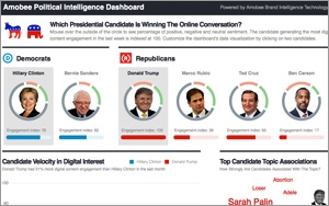
The Amobee Brand Intelligence political dashboard is a different beast -- offering an analysis of the candidates’ online presence.
The candidate with the highest digital content engagement, currently Donald Trump, is indexed at 100. The other candidates’ online engagement can be compared in line-graph form, offering users a snapshot of the past month. Spikes in the data appear mostly where expected.
In addition, Amobee looks at whether sentiment surrounding a specific candidate’s online activity is positive, neutral or negative. Also of interest on the dashboard are topic association clouds, where phrases or words most associated with each candidate are offered.
Principal brand analyst at Amobee Jonathan Cohen says digital engagement can act differently from polls. He noted that engagement data did not spike when Dr. Ben Carson’s poll numbers surged. His poll numbers have since fallen, suggesting that online engagement may be a strong indicator of a candidate’s “stickiness” or “longevity.”
The actual UX of these dashboards is impressive, and will keep voters and bystanders excited and informed about the 2016 race.
