Commentary
Saying Farewell To The Gmail Envelope Is A Win For Visual And UX Design
- by Jennifer Volmer , Op-Ed Contributor, October 21, 2020

Google’s rollout of its new productivity entity, Google Workspace, is not a result of new product development.
Its work-from-home apps and digital tools have long been a part of Google’s product suite. Instead, the rebrand shows us that Google is evolving as a result of the culture change happening around us.
Within the workspace category, rebrands and design changes have accelerated due to the shifts in habits and increasing digitalization in workplaces -- something that was happening long before the current COVID-19 pandemic, but was accelerated by it.
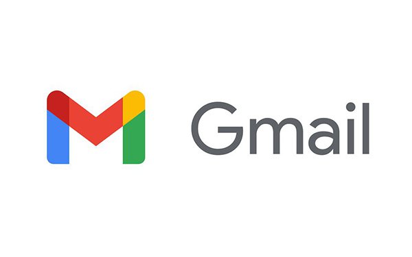
However, while working culture may be shifting, the problem for brands is that user opinion often falls behind this change. The initial reaction to Google ditching the Gmail envelope in favor of a more abstract 'M' was one of confusion and frustration.
Slack found itself in a similar situation last year. While it grew as a workplace collaboration tool, it sought to evolve its design positioning to reflect that, so with a new logo in place, it launched only to be met by a wave of negative criticism.
This user frustration ultimately stems from our familiarity with and attachment to products. But despite initial outrage, in recent years, people are actually adapting to change more rapidly due to the increasing pace of digital acceleration.
With many of us shifting from in-person to virtual workspaces, we have become more comfortable with swift change.
More than that, however, as users of digital products we have had to become accustomed to accommodating the constant evolution of digital media over the last decade or so.
This has meant that our feelings often are not permanent, as Slack well knows after finding that 73% of users said they preferred the redesign when asked once the fuss had subsided. If anything, the fact that people care shows just how connected we are to these brands.
For Google, it is this ease in accepting the fast-paced change that will quickly quell the concerns that have arisen.
But more than that, it is also bolstered by the fact that the strength of its brand equity creates its own sense of familiarity in the design for users, and ultimately, it is providing a solution for our increasingly digital-first environment.
The name change from G Suite to Google Workspace represents the bringing of the workspace products together to form a collaborative and creative environment.
This invites the user into the product because as we continue to work remotely, it becomes less about the apps we use and more about the workspaces we are in.
In our remote world, the concept of integration is appealing to the user because it adds flexibility and ease in accessing and utilizing the connections between the products.
What Google is doing with its logo and UX design across its portfolio reflects that integration.
Replacing the micro details such as the separate colors and individual iconography for each app with the macro design elements like Google’s color palette, builds equity into Google’s ecosystem.
The simplicity of the icons and the user experience will serve Google well, and this can be applied to all brands. Day-to-day users are unlikely to educate themselves on a brand’s purpose and how this connects to the visual elements.
Clarity in the product design and experience must therefore become the explanation for the change made by the brand. Google’s vision is for a future where work is more flexible and connected, and so the development of a simple UI means that the vision is reflected in the experience.
By simplifying the visuals and the product interface, users can quickly understand that Google is providing solutions to the lack of physical connection and is making creation through collaboration easier wherever we are.
As we enter into a new era of working, it won’t be long before we come to appreciate the connected experience that Workspace offers and the famous Gmail envelope becomes a fond memory of emails past.


