 Sometimes a little tweak can make
all the difference in digital marketing. What is the old adage from the early days of Web development? With every additional click that a process requires of the user, you can count on losing another
half of the audience. Apple takes that lesson to heart in adding a new -- but enormously helpful -- pop-up information window to all of the items in its iTunes Store.
Sometime last week, Apple
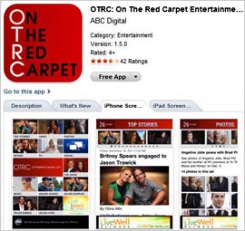
introduced a new function that surfaces more information about a music track, app or podcast by hovering over its icon in the iTunes interface. A diminutive “I” appears in the lower right
corner of the icon, which pops up all of the information you would have gotten by clicking through to a new page. The information varies according to content type. In the Music section, clicking the
information button pops up a list of tracks in the album and the ability to sample tracks from the overlay. In Apps, the user gets a richer merchandising experience, including reviews and ratings,
upgrade notes, and screen shots for both iPhone and iPad versions.
advertisement
advertisement
The dirty little secret of iTunes is that it really is not an optimal interface. In a shop with half a million items, there
must be a better way to surface the most relevant and valuable content than walls of icons. To be sure, my understanding is that most app shopping occurs on the device itself rather than on iTunes.
But I think Apple should spend a lot more time on how to better personalize the mobile content shopping experience. Whenever I go to the Amazon store, the company is actively pushing app
recommendations now along with media. And even the notoriously Dollar Store aesthetics of the Android Marketplace have been upgraded to be much more pleasant.
The new tweak to iTunes
also addresses one of its ongoing problems -- sluggishness. Clicking in and out of pages in that desktop program can be torture. This aspect of the experience alone merits greater attention to a
personalized interface where the categories of content that a user most often references are foremost and intelligent recommendations are fed prominently.
“iTunes” was a cute
moniker in its day. But it really is time for it to evolve into something closer to MyTunes.