 The
so-called native advertising trend of the last year or so likes to think that really good advertising is content, not an interruption. At its best, integrating ads into the social news feed, for
instance, should be an invitation to marketers to step up their creative game. In a perfect world, advertisers would welcome the opportunity to get into the main media tent and do their best to behave
like the content that really brings in the eyeballs.
The
so-called native advertising trend of the last year or so likes to think that really good advertising is content, not an interruption. At its best, integrating ads into the social news feed, for
instance, should be an invitation to marketers to step up their creative game. In a perfect world, advertisers would welcome the opportunity to get into the main media tent and do their best to behave
like the content that really brings in the eyeballs.
The animated GIF is the format most favored in Tumblr, although much of the postings from the citizenry are static images that aim to be
striking. Tumblr shares with Instagram and Vine a certain creative competitiveness among all kinds of posters. These are visual social networks that capture us with surprise and aesthetic
appreciation. One of the cool things about animated GIFs is that unlike the stop-motion techniques inspired by Vine, they usually are about capturing slivers of time rather than collapsing it. Some of
the best GIFs in Tumblr often impress me by grabbing just the right frames from a great film. Each social network seems to have an aesthetic all its own. The Tumblr GIFs are about the captured moment,
gesture, glance, pivotal movement.
advertisement
advertisement
It is hard to tell from Tumblr's year-end collection of in-stream ads whether all the
advertisers were up to getting into the Tumblr vibe. This is their run of what they call the top sponsored post. I am not sure how all of it is measured, by re-posts, notes, likes. Regardless, a lot
of those atop the list did not get there from raw creativity. The animated ad for the Jobs film seems to ride more on geek love for the subject than evocativeness. The ad for Thor is just a shrunken
Ticklr -- albeit one that tracks the superhero's hammer to his hand. I much prefer the inaugural Tumblr ad earlier this year for "The Great Gatsby." Leo toasts us from the feed.
GE does what
it usually does -- stop-motion science project. Okay -- but how did that Vine vid get in here? Its other ad depicting vapor manipulations is much closer to the native mark -- a few frames that make us
want to read about what this is. The multi-panel animation for "Carrie" is the kind of thing that keeps you looking to make sense of the fragments. A similar treatment for "Walking Dead" is not nearly
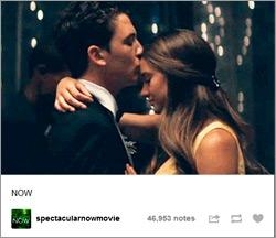
as involving. I think the secret here is not to depict so much as tease the imagination. "Spectacular Now" is brilliant in that it highlights a forehead kiss that intrigues you to know who these
characters are and why that moment was important enough to call out.
The most striking thing about the scroll of Tumblr native ads is that most of them still do look like ads. They are
taking on some of the tones of the feed and all. But generally it just feels like the print and short-spot interstitials that are struggling to fit in. Are there real conversations and relationships
evolving with readers? Come off it. Do they really “add value," as they like to say, to the user experience? Perhaps if they are tightly targeted to a user's passions. But in my use of Tumblr,
along with just about every other social net with sponsored or promoted posts, targeting is loose at best.
Call it a “value add” all you want. It is really an ad that is of
value… to publishers and marketers who figure the best way to turn on consumers who have tuned them out is to get even more in their faces?