Three years ago, you couldn’t so much as swing a cat without hitting Lobster, These days, things are looking a bit
more upright on the font front. Let’s take a look at the typeface trends that have earned their place as the visual voice of 2018.
That ‘70s font.
These quirky, short-slab serif typefaces have low contrast for maximum legibility across a range of sizes. It’s not their utility that’s appealing to marketers, it’s their
good vibe. ‘70s fonts have a warm and cozy personality.

Last year’s Chobani rebrand was the first to bring throwback fonts to
the commercial marketplace, featuring a new logotype and bespoke typeface that invokes ITC Clearface, Cheltenham, Windsor and Bookman.
advertisement
advertisement
Since then, these feel-good fonts have
found their way into the mainstream such as in clothing retailers Lands’ End and Stoned
Immaculate.
Are ‘70s fonts here to stay or will they become pervasive to the point of invisibility? Let’s give it a year or so. I’m enjoying the warmth for
now.
All mine.
Bespoke fonts are hardly new, but their ubiquity is. More companies, particularly techs, are developing custom fonts in-house to
articulate brand identity.
To wit: Airbnb, Apple, Coca-Cola, CNN, Google (Roboto and Product Sans), IBM, Netflix, Samsung, YouTube.
Even Arby’s got in on the act with a spoof “ink of the sandwich world,” Saucy
AF:
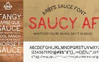
As Dom Hennequin explains in a post on the Envato blog, “They wanted a Helvetica of their own.” Can you blame them?
Made by hand.
There’s something unmistakably intimate and honest about handwriting. It delivers an authenticity of voice that typesetting rarely can.
It’s hardly surprising that fonts mimicking handwriting are taking up more creative space lately.
Bear in mind: This isn’t your standard chalkboard Pinterest
fare. “We’re seeing an uptick in more casual brushstroke fonts that have a little more edge and feel as if they were plucked straight from the era of sign painters,” says Meg Reid of
99designs.com.
True colors.
When it comes to simplicity and
legibility, there’s no substitute for black, but typefaces can communicate greater dimension and reinforce brand identity with strategic use of color.
Enter chromatic fonts.
Colorfonts.wtf breaks it down for us: “A color font file is actually just a regular font file that embeds additional data to
display more graphic properties than the contour shapes of a character.” Simple, but the visual impact of chromatic type is dramatic, allowing for a graphic that features gradients, textures and
transparency.
Fanfare for the working font.
Any discussion of typeface trends would be incomplete without the obligatory tip of the hat to
Helvetica. Polarizing as politics, Helvetica inspires visceral reactions. Some see the iconic 1957 Swiss design as friendly and impartial, while others see it as drab and dry.
Love it or hate it, Helvetica is going nowhere. As Simon Garfield author of "Just My Type: A Book About Fonts," says, “It is
ubiquitous because it fulfills so many demands for modern type.”
So, Helvetica may be a safe, less-than-imaginative choice. Nevertheless, it succeeds in being all
things to audiences -- and when it comes to marketing, it doesn’t get much more revolutionary than that.