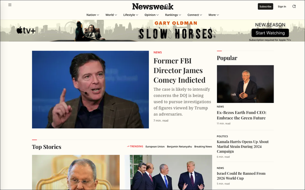
Newsweek has unveiled a
visual redesign and a new brand identity: “A World Drawn Closer.”
The redesign was developed with 2x4, a global design studio. Drawing on Newsweek’s almost
century-long legacy, the redesign is anchored by a refined wordmark, the dynamic “N” icon, and a red-and-paper palette.
“Our new identity is both a tribute
to Newsweek’s extraordinary legacy and a bold step into its next chapter,” says Dev Pragad, owner and CEO of Newsweek, in a statement. “For nearly a
century, Newsweek has been interwoven with the global conversation, chronicling history and connecting audiences across borders. This redesign is a strategic evolution that
strengthens our role in a rapidly changing media landscape.”
advertisement
advertisement
The new tagline, “A World Drawn Closer," reflects Newsweek’s self-defined mission to bridge
divides and bring audiences closer to the people, ideas and events shaping our time.
Every touchpoint is aligned through a unified brand system that aims to signal consistency, readability and
trust. The redesign unites the magazine, website, social media presence, newsletters, video programming and branded franchises, covering features like the Fairness Meter, the Bulletin and sub-brands
like Newsweek Studios, Wallet, Rankings, and Better Planet.
According to Newsweek, the new look incorporates:
- Color — high-contrast blacks and whites for
brand recognition, in addition to Newsweek Red and Paper
- Photography & illustration — human-centered imagery that reflects the immediacy of
Newsweek’s journalism
- Data Design — visual metaphors and intuitive charts to make statistics more dynamic and reader-friendly
“We collaborated to develop a design language that brings clarity, strength, and immediacy to every platform, digital, print, and beyond, ensuring Newsweek’s voice is as impactful
visually as it is editorially,” says Michael Rock, founding partner and executive creative director at 2x4, in a statement.