


June 3 - 6, 2024

electronics
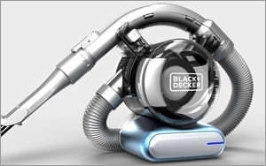
Black + Decker Redesign All About The Simple Truth
- by Karl Greenberg , January 16, 2014
 Power
tool and appliance brand Black + Decker has a new look, new products and a complete redesign of its logo (bye-bye &, hello +), and it's all about simplicity.
Power
tool and appliance brand Black + Decker has a new look, new products and a complete redesign of its logo (bye-bye &, hello +), and it's all about simplicity. It is part of a repositioning process that began two years ago and went into the execution stage when parent Stanley Black & Decker brought in Lippincott, a New York-based marketing strategy, design and consumer experience firm, to head up the program on the agency side. Job one for the agency was last year’s repositioning of the company's Stanley Tools brand.
The new strategy, design, and customer experience blueprint for B+D will accompany product releases this year aligning with a new aesthetic. Lippincott partner and designer Marc Hohmann tells Marketing Daily that at issue was consumers’ lost affinity for the brand. The reasons were manifold, although one was that the brand had become amorphous because it had expanded its product portfolio way beyond its legacy offerings around DIY tools into everything from toasters to mowers.
advertisement
advertisement
"The other issue is that there's an ongoing product-feature war where every other month someone brings a new tool to market," he says. "And Black + Decker's products, like everyone's, had become over-designed. The brand was suffering from too much of everything: too much product, design, too broad a spectrum."
Frank DeSantis, director of brand marketing at B+D, tells Marketing Daily that two years ago the company dipped its toes into reinvention waters with brand and retail market research around where the brand stood and what it meant. "Six months in, we realized it was time for a change," he says. Lippincott's initial sanguine take was that the brand actually had strong global identity, particularly for in-the-home products, versus, say, the company's Dewalt brand, which has very strong identity as a professional job-site product line.
The new idea behind the logo, packaging and new, less ornate products is powerful simplicity, notes Hohmann. "The fact is, the more 'designed', the more streamlined these products are, and the more they are promoted for their features, the cheaper they seem to become to consumers. We learned that, really, it's about how to make it more basic because that makes the consumer feel more empowered, and it speaks to 'now' rather than to the future."
The new logo is a slimmer, unadorned black font against a white background -- a big change from the "Black & Decker" thick, white block lettering against a black background and next to an orange hexagon of uncertain meaning (except maybe as a stylized nut.) Hohmann says Uniqlo, Ikea and Adidas evince good paradigms for the same sense of empowerment through simplicity extended to product. "The goal is to make each product look similar. With Braun or Bosch, there is that language for all products around industrial design and German engineering. "With Adidas, you sum up the brand in its entirety with those three stripes."
Says DeSantis: "Our playground is the home, but our logo and the hexagonal shape had absolutely no bearing on our products -- no relevance to what we were. We wanted to be more modern and more fresh and appeal to a younger generation."
He says that going forward, there will likely be greater scrutiny of the portfolio to winnow out products that don't make sense for the brand. "Frankly, we had looked at opportunities over the past last 10 years, and there are areas where we expanded too far. So we might consider eliminating products that don't make sense now that we have a clear focus. We have ideas about where we want to be, but we won't change drastically. It's more a longer-term strategy." He adds that the company will launch a new campaign for the fourth quarter with TV, digital and print in some as-yet-undetermined combination.
