Since its launch in 2005, digital tech
publisher TechCrunch has grown both its audience and reach. But over those years, its appearance had gotten a little dusty—its last redesign was in 2013.
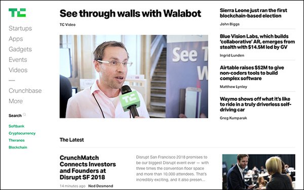
This week, the
site unveiled a new design, promising a cleaner reading and ad experience, in addition to faster loading pages and seamless navigation. It notes on its site that its staff of three engineers found it
difficult to keep up over the years.
Collaborating with digital design and development firm Work & Co, TechCrunch wanted to offer something sleeker to its audience, as well
as rein in the many variations of “TechCrunch green” that littered the site.
In February, the publisher allowed 10% of its readers to test out the new site, built
from the ground up rather than modifying the existing version.
advertisement
advertisement
“This presented a unique challenge and opportunity. We wanted to build a future foundation that would be flexible enough to
elegantly accommodate things we haven’t even thought of yet, but solid enough to stand the test of time,” editor Nicole Wilke stated in a blogpost on the site.
Some of the changes include a single page style React
app, decoupled from its WordPress backend, eliminating the need for full page loads each time a reader wants to read something new. TechCrunch states this allows “for a reading
experience where articles could increasingly relate to each other and to the broader context in which they emerge.”
The tech site wanted to ensure readers could access the main feed
easily each time they navigated away, leading to pageless opening and closing of articles. The articles simply snap shut when you’ve finished reading and take you directly back to the
homepage.
A small circular icon with an “x” at the top lets the reader know how far they’ve progressed in the story, when they’re finished and allows them to close out
the story.
Stories are arranged into groups that are meant to create a conversation with each other and the reader. The company’s philosophy is: “Page views are a BS metric favored
by people who love to game the system. TechCrunch is focused instead on engaging our readers by shipping genuine scoops, analysis and context and compelling conversations that keep you glued
to the site.”
Additionally, ads are fewer and placed more effectively, so users can enjoy their reading experience rather than tolerate a cluttered page.