Jaguar is launching a new brand identity that includes
a new logo, wordmark, typeface and color palette.
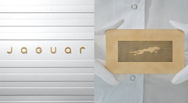
“The typeface—which Jaguar refers to as a ‘device mark’—looks crisp and modern, with the word
‘Jaguar’ spelled out in a mix of lowercase and uppercase letters,” according to Car and
Driver. “The typeface is presented here in a gold hue on a white backdrop of horizontally oriented rectangles.”
Jaguar Chief Creative Officer Gerry McGovern
calls the new branding “exuberant modernism” that “is imaginative, bold and artistic at every touchpoint. It is unique and fearless.”
The effort was two
years in the making.
advertisement
advertisement
“Jaguar has undertaken all this work in-house, ripping up the branding rulebook by discarding almost all the equity and associations that have
accreted since the company was founded in 1935,” according to Wallpaper.
“That’s not to say that nothing remains, however, for the famous leaping cat symbol has been burnished and rethought as the ‘Makers Mark,’ along with an all-new typeface for
the Device Mark, plus a dedicated Monogram and a signature graphic pattern, which Jaguar is calling its Strikethrough.”
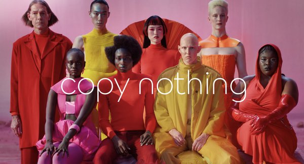
The effort includes the phrase “Copy
Nothing,” which is also the theme of a “public installation” at Miami Art Week on Dec. 2.
“And perhaps anticipating the controversy such a comprehensive
rebirth might prompt, the brand added that when it comes to its visual identity, it is ‘not afraid to polarise,’” according to Creative Bloq. “So while the new wordmark, which combines upper and
lowercase letters might look like one of the best logos for some, it could prove too much to stomach for others.”
The automaker unveiled the new brand identity in a
video on social media Tuesday.
“The spot has drawn some reactions online that range from puzzled to dismayed,” according to NBC New York. “One communications professional on
X called the advertisement ‘disastrous’ for being overly focused on branding and not on the product itself.”
Jaguar held a media briefing at
its headquarters in Gaydon, England, last week, where it revealed there will be an upcoming lineup of three high-priced EVs.
“Jaguar is starting at ground level as it seeks to
rebuild the brand’s cachet as one of the world’s most desired marques, one that harkens back to founder William Lyons’ statement that a Jaguar should be a ‘copy of
nothing,’” notes WardsAuto. “Whether the design team behind carrying that ethos
into the 21st century is successful in the marketplace remains to be seen, but this much is certain: The edict to 'copy nothing’ in redefining the brand and its products marks a startling
departure from its storied and now-distant past.”
