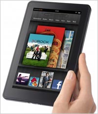
 On one level, the Kindle Fire had me at hello. Literally, the device came out of the box already knowing my identity. It brought forward that massive
database of material Amazon has collected on me over the last decade. The seven-inch device started up and called me by name, even met me with the Kindle purchases I already had made on previous
iterations of their device. You have to admit, this is pretty neighborly of them and something that pulls you into their grasp quickly.
And their grasp is precisely the feeling one gets on
the Fire. You are in the middle of one of the most evolved e-commerce machines on the planet. The stores for music, movies, books and magazines are more smoothly integrated with the experience
throughout than either on the iPad or the Nook Color (I am still waiting for B&N’s Tablet), and that marvelous Amazon sense of merchandising is ever-present. The recommendations are
there. The content I have already purchased and stored in the Amazon cloud is there. For instance, the hours I spent uploading my music tracks into the Amazon Cloud Drive a month or so ago are all
there for me to stream at will.
advertisement
advertisement
Likewise the integration of the Instant video library for Prime customers is about as seamless as on Netflix. I was able to rent "Horrible Bosses" and watch
the first half on the Fire and resume on the Web. Even better, Amazon’s merchandising chops are as ready to undercut Apple pricing here as they were in music. This particular film had a
special 99-cent price for viewing across 48 hours after starting. Apple was still renting the same film for $3.99 for 24 hours. My first impression is that selling this device at a loss ultimately
pays back for Amazon in the volume of additional media its sells.
All that said, the interface needs a rewrite. Navigation is divided between the top and the bottom of the screen, forcing
the user to scan and think a few times before knowing where best to press to get to a previous or home screen. The home screen piles on a long row of icons indicating all of your recently accessed
items. The effect is good the first few times you open the device, but ultimately it requires too much swiping and drilling to get at the broad range of apps you want always at hand. In the end, you
just want a fully customizable home screen that includes the items you most often neeed, not the ones you just used.
Then there's the surprising sluggishness of the device. The Web
acceleration technology that Amazon boasted of simply is not in evidence here. Programs take longer to load than you would think they should on a device with a relatively advanced processor, even
when handling books. The touch screen seems responsive, which is a real advantage over many non-iPad contenders. But basic operations feel less than smooth.
The biggest miss for me so far in
the Kindle Fire is that Amazon has created an intimate device that feels more like theirs than mine. When they know my name from the get-go it feels warm and cozy -- but not like my home. It feels
more as if I am being warmly welcomed into their house. At least so far, Amazon appears to have created a personal device that doesn’t feel all that personal. When using the Fire I keep
wondering, is this about me, or is it about them?