After around 15 years, Mountain Dew has
found its vowels again.
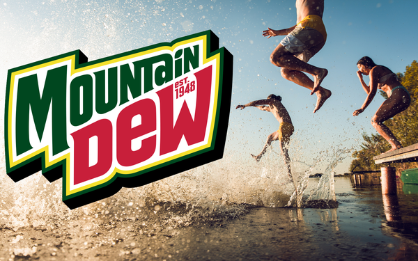
The brand unveiled its new logo -- eschewing the “Mtn Dew” stylization officially introduced in the U.S. market in 2009 –-- in favor of the full brand
name, while tying the brand’s visual identity back to mountainous peaks portrayed in the background as it approaches its 75th anniversary. Mountain Dew’s new logo also includes small text
reading “Est. 1948” over the “W” in its brand name, a nod to the year the trademark was officially established.
“Mountain Dew is reclaiming the mountain with a
new logo and visual identity that is synonymous with adventure, celebrating the great outdoors and embracing the ‘Do The Dew’ spirit,” JP Bittencourt, Mountain Dew’s vice
president of marketing, said in a statement, while alluding to plans for the brand to “lean into” its “rich history” as it works to “reimagine the next 75 years of the
brand.”
advertisement
advertisement
The new visual identity will also include “a sunny refreshed color palette, and graphic outdoor landscapes unique to the Mountain Dew flavors,” running across its
physical and digital assets, according to a statement from PepsiCo Chief Design Officer Mauro Porcini. The new color palette features “citrus-inspired yellow hues” designed to evoke
the beverage’s flavor profile, as well as a citrus leaf dotting the “i” in the brand name, according to a fact sheet about the changes provided by the brand.

Mountain Dew will roll out its new logo and
visual identity next summer, with the first packaging sporting the refresh hitting store shelves as early as May 2025.
Naturally, PepsiCo’s move to refresh its graphic identity was not a
spur-of-the moment decision. “Our team conducted extensive research with Mountain Dew fans to better understand how the brand could be seen as more approachable,” Umi Patel, PepsiCo
Beverages North America vice president, consumer insights and analytics, said in a statement, claiming the changes "tested positively and drove positive purchase intent across Dew loyalists, Gen Z,
and millennial consumers.”
According to Patel, the new visual identity was also designed to “ showcase the full portfolio of flavors…in a way that would resonate with
consumers, especially Gen Z [consumers] who seek out new flavor options.” The brand has expanded its roster of flavors in recent years, including the addition of Baja Blast as a permanent
Mountain Dew flavor earlier this year.
Mountain Dew’s unveiling of its new logo builds on its recent marketing efforts more closely aligning the brand to its mountainous roots. In
August, the brand kicked off a “Welcome To Mountain Time” campaign laying claim to “ownership” of the Mountain Time
Zone and introducing a character named “The Mountain Dude.”
It also happens to follow the introduction of a new rival in the form of Olipop’s newest flavor, Ridge Rush.
launched with a campaign featuring an “A Can Of Do” line jabbing
at the long-running PepsiCo brand.