Can the design of pharma websites affect consumer health?
An email touting new research from George Mason University’s Costello College of Business seemed to suggest just that, so I
decided to take a look at the study.
Well, not the study itself. Since the research came not from marketing academics, but from the college’s information system and operations management
department, the prose proved too technical for my eyes. So I opted to read a summary of the
study “that aimed to understand how pharmaceutical websites can better present both risks and benefits without overwhelming or misleading consumers.”
Summaries, it turns out,
are also the preferred choice of many pharma websites in presenting drug benefits and risks. They often come in the form of bulleted lists -- text only, of course.
The study contrasts
summarization website techniques with “salient” (more prominent or noticeable) techniques, such as using pop-up graphics to show drug risks. The latter “grab attention in the
moment,” the researchers explain, while summarizing “enables sustained processing of multifaceted information.”
advertisement
advertisement
Surprise! “Sometimes, designs that technically
over-emphasize risks actually help patients make better choices,” relates the study summary. “Other times, slightly skewing the presentation—e.g., emphasizing risk more heavily in
early stages—can enhance consumer outcomes and trust.”
The research suggests that pharma firms blend salience and summarization -- as in a table format (below) -- “to
promote simultaneous awareness of risks and benefits.”
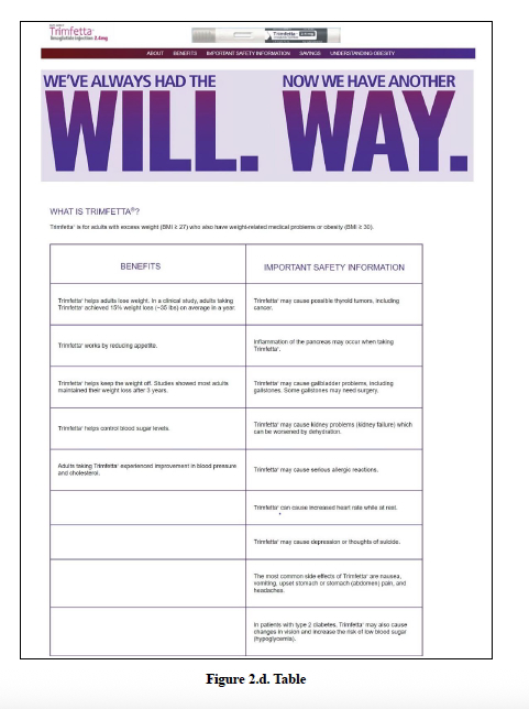
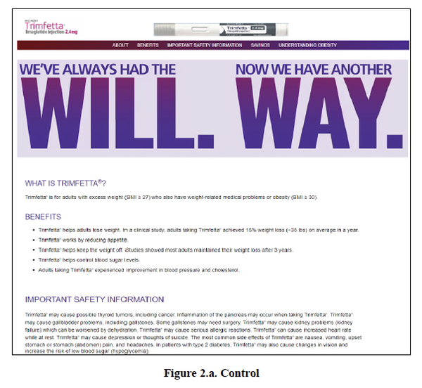
While such blending was found to increase risk recognition by 13%, it also improved benefit recall by 9%, and raised follow-up intention by 23% compared with a standard format (below) which
consists of benefits listed as bullet points, followed by risks in paragraph format.
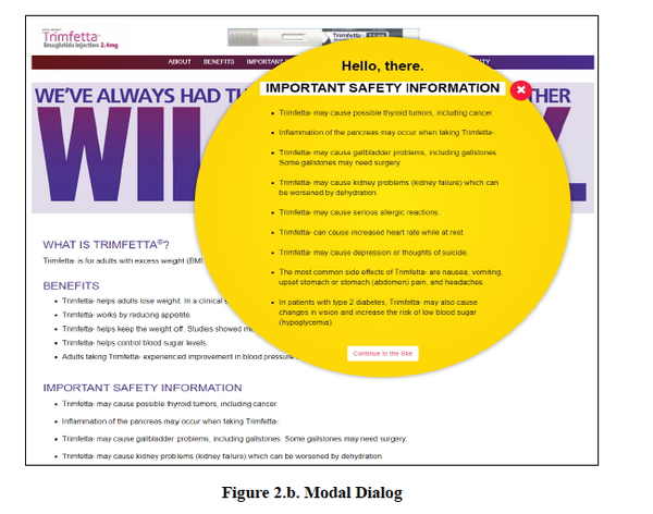
By contrast, a graphic pop-up design for safety information (below), which prioritizes salience
alone, raised risk recognition by 12% and follow-up intention by 19% -- but reduced benefit recall by about 11%, “highlighting a trade-off between engagement and balance.”
In contrast, the study, says, a box design (below) prioritized benefits but underemphasized risks, thus undermining follow-up actions.”
Study co-author Siddharth Bhattacharya tells Pharma & Health Insider
one reason why this research should be of interest to pharma companies: “People are more and more going to branded drug websites to get some information before consulting their
doctors.”
Furthermore, the study cites statistics from Standard of Care, described as “a repository of knowledge in the field of medicine,” that websites “account for
nearly 8% of industry promotional budgets.”
The study used eye-tracking technology on 452 participants to measure what they noticed, how long they lingered, what they remembered, and
what actions they intended to take.
Each participant was shown one of the four different versions of a mock pharmaceutical website above for a hypothetical weight-loss drug called Trimfetta
(not to be confused with triumfetta, an actual plant sometimes used to treat symptoms like pain, stomach and reproductive problems).