Alaska Airlines’ iconic Eskimo logo just received a major makeover.
In part the
comprehensive rebranding is designed to convey how much the airline cares about its customers. And with nightmare stories of passengers being stranded on runways for 12 hours or more playing the caring card might not be a bad idea given the perception held by some
that airlines are the least caring companies on the planet.
Branding and design shop Hornall Anderson led the makeover effort. The shop stated that the effort would provide the redesigned
Eskimo icon a voice "as a proud, welcoming presence of wisdom, warmth and care." And, laying it on even thicker, the shop added, "The smiling Eskimo and his colorful energy now represent the soul of
the airline wherever and whenever Alaska interacts with flyers."
advertisement
advertisement
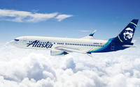
The new branding includes a redo for both the exteriors and interiors of the airline’s fleet as well as for food and
beverage packaging, bag tags, airport signage, website and mobile app. Employee uniforms are also being updated.
Commenting on a company blog, Sangita Woerner, Alaska’s vice president of
marketing, said, “We’ve added 90 new markets in the past five years. As we continue to grow, we are updating the outward expression of our brand so it shows up bolder wherever we
fly.”
The new look follows several earlier cabin enhancements made by the carrier including free entertainment, a revised entrée menu and seatback power.