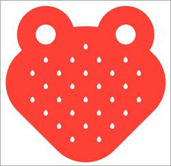
 After 20 years, StrawberryFrog is getting a makeover. The New York-based shop is retiring its old green and red logo in favor of a more "poisonous" image.
"If you’re
not familiar with our work, the name StrawberryFrog can conjure up visuals of a cute little animal," says Craig Love, ECD, StrawberryFrog. "But in the jungle, strawberry frogs are actually poisonous.
We wanted our new look to reflect that kind of edge. We’re a progressive brand that spells trouble for the old school agency model and the new logo captures that power."
The
redesign was done in house. "We’re a brand that embraces change, so as we neared our 20th anniversary the time was right to reimagine our identity for 2016 and beyond," says Love. "With only a
few very simple shapes, the new logo captures everything we aspire to be. It’s strong and powerful, small but mighty and it doesn’t feel corporate.”
advertisement
advertisement
Agency Co-Founder
Scott Goodson said he was emotional about the change given “all that we’ve done over the years.” But he added, “Change is inevitable, and the new logo captures a new
ethos with the same dinosaur challenging spirit. It's time for a change, and this wonderful logo is fresh and cheeky.”
The new image appears across all branding both digitally and
physically. There are even t-shirts for SF employees.