Luxury brands Jaguar Land Rover and Porsche
are each unveiling a new corporate identity.
Now known simply by its initials, JLR aspires to remove ambiguity and amplify the unique DNA of each of JLR’s brands: Range Rover,
Defender, Discovery and Jaguar.
As part of its move to adopt a “House of Brands” organization, the company also aims to accelerate the delivery of the company’s
vision to be “Proud Creators of Modern Luxury.”
The Land Rover heritage mark will remain integral and will be visible on vehicles, online platforms and retail sites, per
the automaker.
The descending "J" aspires to add elegance, while the lighter weight of the emblem illustrates the step change to refinement and modernity, the company
says.
advertisement
advertisement
“Modernizing’” is difficult for heritage brands to navigate, says Chris Burzminski, partner, Prophet, a growth strategy consulting firm.
“But if handled with the care and reverence for heritage we see happening from the JLR leadership, consumers could feel that the brands are even more relevant than ever,”
Burzminski tells Marketing Daily.
Individual vehicle brands are in some case more relevant than the manufacturer brands themselves, such as Ford with the return of
the Bronco and the Mustang extension into electric vehicles, he says.
“So this follows a natural progression in the industry that will be comfortable for consumers as they
navigate choice,” Burzminski says. “In addition, the ‘Land Rover’ brand needed to create some breathing room if they also want to build the JLR corporate brand, as it
previously was seemingly separating the two main entities, instead of having a collective house of brands approach.”
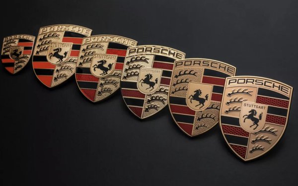
Meanwhile, Porsche revealed a new modernized Porsche crest
and includes a return of Stuttgart, the brand’s hometown, at the top of the interior crest, in black for the first time. The introduction will start on the vehicle side at the end of 2023.
Porsche has used the crest since 1952. The trademark was updated in 1954, 1963, 1973, 1994 and 2008.
Despite a number of revisions, the Porsche crest is still
immediately recognizable. With much attention to detail over a three-year process, Joachim Paetzel, specialist for color and trim at style Porsche, worked with design colleagues and marketing experts
to carefully modernize the iconic logo.
“The time factor is very important in a maturing process such as this,” Paetzel says. “A trademark is not designed
‘off the cuff’ within a few days. You have to go back to it again and again, sometimes at longer intervals. The second or third look can reveal to you things that you want to optimize,
until it finally achieves a harmonious, natural effect. Only then can you say with satisfaction: ‘This is exactly how it has to be!’”
It was also important to the
designers to match precisely the 2D and 3D versions of the crest. The trademark is not only experienced in its physical form on the body and in the interior of the sports car. It must also be
effective in the brand identity in communications and at the point of sale.