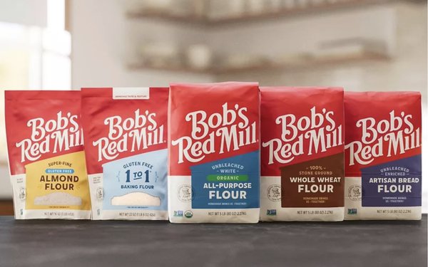
Bob's Red Mill is giving Bob a pink slip, at
least on its packaging.
The Milwaukee brand has revealed a modernized look with a custom typeface and new packaging with "wrap-around storytelling.”
The moves have sparked comments similar to another rebranding that went horribly astray — Cracker Barrel.
“In another world, this would be seen as a
textbook example of how to upgrade a visual identity by balancing heritage and modernization,” according to Creative Bloq. “The redesign tidies up the visual presentation of the
brand and improves shop-shelf legibility to make it easier to find the products, without abandoning the warmth of the vintage feel. But U.S. brands should know by now the dangers of removing old men
from their identities.”
advertisement
advertisement
Cracker Barrel ultimately cancelled its logo redesign last year and fired its design firm after being accused of “wokeness,” according to Marketing Daily.
“Like the aborted Cracker
Barrel rebrand, the new Bob's Red Mill logo highlights the risks of modernizing a brand that's been built around values of tradition and heritage,” notes Creative Bloq. “The old logo
design looked dated, but that was the whole point. The new look is superior in terms of ease of application and identifying products on a crowded shelf, but it also seems aimed at a broader audience
at the cost of appearing more generic and losing the nostalgia and association with old-time quality that gave the brand its original appeal.”
Founder Bob Moore, who died just
over two years ago at the age of 94, remains at the center of a very small seal of quality on the new packaging to highlight “the care, quality and commitment that the brand’s founder
passed on to all Bob’s Red Mill employee owners,” the company said.
The company spent three years on a full branding overhaul to bring all of its products back
under one mill roof.
“While in recent years countless brands have simplified their identities to fit a minimalist aesthetic trend, Bob’s Red Mill’s rebrand is
one example of an overhaul wherein less is truly more,” according to Fast Company. “If there was a single
word to describe Bob’s Red Mill’s old packaging, it would be unorganized.”
The new Bob’s Red Mill design will debut on core flours in September before
expanding to other product categories throughout 2027, according to World-Grain.com.