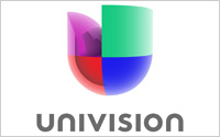
 Univision, which is bolstering its portfolio of cable networks and planning a joint venture with ABC News, is also renovating its logo after decades.
The four colors are the same and the “U” remains, but the company says it is “evocative of a human heart” within its “three-dimensional” incarnation.
The prior Univision logo has been around since the company launched with a single station in San Antonio in 1962, the company said. It now has two broadcast networks, a slew of local stations and a
24/7 cable sports network.
The ABC News team-up, expected to launch in 2013, will focus on the economy, entertainment, immigration, education, and politics -- the issues most relevant
for U.S. Hispanics. Miguel Ferrer will be the first executive producer, digital for the new company.
advertisement
advertisement
CEO Randy Falco, who has been one of the more active top media executives of late, stated
that the logo is “a direct reflection of the Hispanic community we serve – multidimensional, dynamic, modern and bold.” He also compared the Univision brand’s equity to Apple,
Coke and Kleenex.
The new logo, which keeps the purple, green, red and blue hues for its four “quadrants,” closes the thin gap between them, “representing unity,
collaboration and the merging of cultures in the U.S., not to mention Univision’s integration across its platforms,” stated Ruth Gaviria, a senior vice president in marketing.
Brand consultant Wolff Olins developed the logo. Recently, the company worked on the USA Today redesign.