There's
little coincidence when clothing designers start to use the same turquoise or appliance brands introduce burgundy-hued toasters. Indeed, these color directives are regularly guided by Pantone, a color
forecasting and technology agency.
For the past 50 years, Pantone has been an insider's secret known primarily for their color consulting and trend forecasting.
Now, Pantone's ad
agency of record Sub Rosa is introducing "Make It Brilliant," the first brand campaign to convey Pantone’s array of products through a display of dancers and various shades of light and
color.
"In the past, Pantone has had challenges streamlining their brand creative to clearly communicate the brand’s color intelligence acumen, while also clearly articulating the
value of its product offerings -- graphics, fashion and home, and plastics," says Michael Ventura, CEO, Sub Rosa. He added that it's important to "create something visually compelling and creatively
recognizable that elicits sharing through social networks and PR, as the world is hungry for stimulating content."
advertisement
advertisement
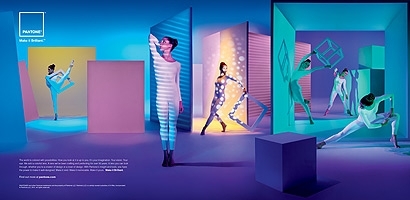
The print and digital campaign incorporates color chosen from Pantone’s
trend forecasts to “paint" the walls with light instead of using colored backdrops. "Light is a metaphor for Pantone, keeping the fidelity and truth of color while being able to apply its
meaning across any medium," says Ventura. "Linked both to the science of color and to the tool with which we can make materials, 'Make it Brilliant' campaign brings objects, materials and experiences
to life in a brilliant way."
At the same time, this campaign is designed to resonate across multiple audiences. Through light and prop placements on display triptychs used in ads, Sub
Rosa visually conveys a one-dimensional experience in the left triptych for Graphics, a two-dimensional experience in the middle triptych that represents Fashion & Home, and three-dimensional
space in the third triptych representing Industrial Design.
"'Make it Brilliant' means something distinct to each audience segment," says Ventura. "For
Pantone internally, it’s a rallying cry, a goal, a standard that [it] holds to each day. For the color professional, it’s inspiration to make their work brilliant and bold. For the color
trendsetter, it’s intelligence; smart, savvy insights that keep them on trend and ahead of trend. For the consumer, it’s an ingredient, a product that outshines another, resulting in a
brilliant purchase decision."
The campaign currently runs online and via Pantone's social media platforms: Twitter, Instagram, Facebook, Pinterest -- as well as via print ads in Graphic
Design USA, PRINT, and HOW.
The New York-based Sub Rosa was named agency of record for Pantone in June.