BritBox tapped Sibling Rivalry to create a new brand identity,
setting it apart in crowded streaming landscape.
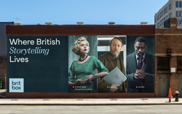
Rather than rely on standard British imagery, such as the flag, or tropes, the agency created a single-color logo. Rebranding also
includes a new set of visual layouts, called “macro moments.”
OOH work is currently rolling out across product and communications in North America, Australia and the
Nordics.
In addition, BritBox worked with composer Joel Pickard, who devised a distinctive sonic mnemonic that highlight's the brand's sensibility. The current creative
extends the "See It
Differently" campaign, which began in spring 2025.
advertisement
advertisement
Bo Bishop, strategy director at Sibling Rivalry, told Agency Daily: “The strongest streaming brands are
instantly recognizable both visually and sonically. BritBox’s refreshed identity elevates ‘British’ from a genre into an expansive state of mind, using sound, motion and voice to
express a character-driven sensibility that’s brilliantly BritBox.”
Sibling Rivalry has done ad work for Google, Apple, and Ford.