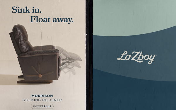
La-Z-Boy has launched its first brand
refresh, including a new logo, for the first time in 22 years.
The softened new logo reflects the curves of La-Z-Boy’s famous recliner and its original 1927 look, highlighting the L, Z
and hyphens. It's a modern look that respects tradition.
Diana Quenomoen, vice president-group design director, Colle McVoy, said: “Every letterform was intentionally shaped to echo the
contours of La-Z-Boy’s furniture. Rounded, soft and generously cushioned — each letter flows effortlessly into the next, mimicking the feeling of sinking into a favorite chair. And, the
italicized tilt of the logo evokes reclining, a gesture of ease where the body can actually exhale.”
The agency also developed La-Z-Boy’s internal brand book and style guide,
adopted company-wide, to ensure consistency. The color palette, comprised of burnt vermilion and soft Celadon greens, evokes warmth.
advertisement
advertisement
La-Z-Boy is shifting from selling recliners to owning comfort across every part of its brand experience. Relaxation is now positioned as a form of
wellness and self-care.
“This updated identity gives us a broader platform to amplify an already dynamic brand — one that anyone can find their fit in,” added Christy
Hoskins, vice president-CMO, La-Z-Boy.