Hardin's Creek features some of the
James B. Beam Distilling Co.'s rarest whiskeys.
Founded in 2022, the brand embarked on a bourbon adventure: identical mashbills were spread across its Kentucky warehouses. Varying heights,
ages and micro-climates were left to mature for over 11 years, producing singular spirits.
To send that message to Gen Z, Hardin's Creek asked global branding and design agency Design Bridge
and Partners to create new labels, transporting customers to a singular realm.
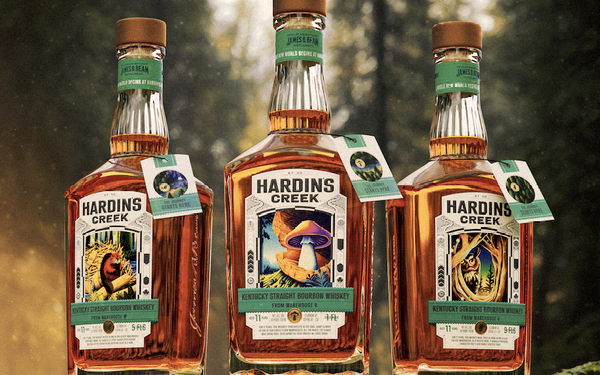
Each sports a symbolic mascot, a nod to the specific warehouse the bourbon is aged in. Those from Warehouse
R feature a mushroom, as the space is windowless and damp. Warehouse W is physically located close to the water and marked by a beaver. Warehouse G bears an owl, since it's nine stories. Every
expression has a distinct flavor and aroma, overseen by master distiller Freddie Noe.
advertisement
advertisement
The artistry, illustrated by Max Löffler is rendered in a mature fantasy style, with custom
typography by Rob Clarke.
“Loeffler’s style was a perfect match for our vision — it’s playful, but has gravitas. It feels modern, futuristic even, but also grainy and
nostalgic. Most importantly, it’s immersive and transforms each label into an otherworldly porta,” Marlee Bruning, creative director at Design Bridge and Partners, told Agency
Daily.
“We want people, especially Gen Z and newcomers to whiskey, to feel invited to step into the world of Hardin’s Creek and help create it alongside the brand. We provide
the elements of play: codes, symbols,and some translations. But it’s up to the consumer to define the game,” she added.
The agency's design work includes Pastiglie Leone, Forest
Carbon, Hellman's and BBC Eurovision.