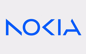
Early 2023 has seen a flood of brand and product redesigns. We have seen new logos from Pepsi, Nokia and Fanta.
Marketing Daily talked with some branding experts who shared their
perspective on the logo redesigns. Here are some of their comments.
Pepsi

The major change Pepsi has made to its logo, which will roll out this fall, is to place the
beverage’s name squarely on the logo. The name previously appeared under the logo.
Todd Kaplan, Pepsi’s CMO, also told Fast Company that black is an “intentional color
we added with [Pepsi] Zero Sugar, which will be the lead brand we use marketing. [Black] can act as a master brand statement.”
“I think it's very smart that Pepsi recognizes that
logos are the face of brands that have long term relationship with their consumers. And a face evolves -- it doesn't change,” said Marc de Swan Aarons, founder of the Institute for Real
Growth.
advertisement
advertisement
Nokia

Nokia also recently redesigned its logo. According to
Dezeen, it is Nokia’s first redesign in 45 years.
Drew Kerr, brand communications consultant for Four Corners Communications, said he thought the Nokia logo seemed dated. “There
was a time when logos like this were hot -- missing elements of letters implied binary code from computers and being too cool for school,” he said. “Now it seems like a bad art project by
a student who peeked in his dad's 90s yearbook.”
Han Lin, group executive design director at R/GA, applauded the redesign. “I think a rebrand makes complete sense, given that the
previous Nokia logo was so connected to their consumer products, and they are no longer in that space. And I think it’s a well-drawn logo. I don’t think it’s hard to read. Time will
tell, but I do think a bit of the character of the brand is lost in the new logo.”
Elliott Scott, creative director at Applied Design, said the Nokia redesign was “a wild departure
from their past.” He added: “The execution may be polarizing, but it’s brave and worth applauding.”
Fanta

Sister PepsiCo brand Fanta also recently introduced a new logo. The
new logo drops the orange that has long been associated with the brand.
Kerr lauded Pepsi’s approach. “Both the Pepsi and Fanta logos have been made over with very warm and
animated styles. They both ask for attention without going overboard. The Fanta one in particular seems influenced by comic books, with its 3D effect. Pepsi notably went from all lower case to all
upper case, which feels assertive. Both of these redesigns are eye-catching and dynamic,” he said.
“For Fanta, it went from looking like a lava lamp to a Saturday morning
cartoon,” said David Berkowitz, founder of the blog Serialmarketer.net. “It used to scream, 'Groovy!' Now it screams, 'Hey kids, want to bounce off some walls?!' Granted, given its logo
history for much of the ‘70s through the ‘90s, I'd have thought the logo was for an airline if I didn't know what a 'Fanta' was."
"It’s interesting to see Fanta and Nokia
moving their brands forward, in small steps or giant leaps. Pepsi is returning to the past, but it doesn’t feel exactly like a step backward,” said Scott.
“Fanta has
taken small steps to move their brand forward in nice ways. The move to drop the orange in the logo allows them to move forward with more flavors equally (my favorite flavor has always been pineapple,
so it's nice to see it get the love it deserves). The colors are bright, fun, and tasty, and I love the brighter blue as a strong through-line. I'm looking forward to seeing how the elements evolve in
the next round.”