As someone who has covered the evolution of television
technology for nearly half a century -- from broadcast to satellite/cable to digital and apps -- I'll confess that the way the advertising and TV industry segments confuses the heck out of me. In
part, that's because different interest groups within the industry historically have different points of view on what variants represent and how much they should be counted, discounted and/or factored
into the underlying currencies used to buy and sell the ad-supported parts and determine the effective reach and frequency of viewers when they do.
In other words, the whole framework was
greatly in need of -- and frankly overdue for -- a reboot. That begins effective today with a call from none other than the Advertising Research Foundation (ARF), which has spent years calibrating and
re-calibrating how Americans connect to TV in all its varied forms.
advertisement
advertisement
Dubbed DASH -- which is not exactly an acronym, but stands for "Universe Study of Device and Account Sharing" -- the
multiyear research initiative has dug deep into the way American consumers access television and/or premium and ad-supported streaming service content, including overlaps and redundancies, in order to
create a pure, objective view that the advertising and TV industry can use to calibrate the weights they use to measure the overall universe, or segments within it.
The project has largely
been successful and DASH's periodic benchmarks have been utilized by various TV measurement and advertising currencies to calibrate their own universe estimates.
Effective with the release of
a new study drawing from its spring 2024 research, as well as previous studies going back to spring 2022, the ARF is making the case for a new, simplified framework for categorizing how Americans
connect with television.
You can read the ARF's entire white paper on the subject here, but I put
together the pie chart above to give you a quick way of understanding the six forms of connectivity, as well as their relative current shares of U.S. television access.
As simple and elegant
as the new framework is, it still requires some factoring to understand it, because there is still a bit of overlap in terms of the way average American households access television.
For
example, the framework estimates five of the segments can be combined to produce a relatively pure-play "linear TV universe" comprising 74.4% of a greater universe, while four of the segments combine
to comprise 59.0% of it.
I did say the approach still requires factoring, right?
This is partly due to the fact that there now are so many hybrid models of ad-supported, pay and
combinations thereof being offered by platforms and apps, that you have to pick your poison and define the universe you want to use to frame what you consider television to be. Linear vs. pay is how
the ARF is recommending it.
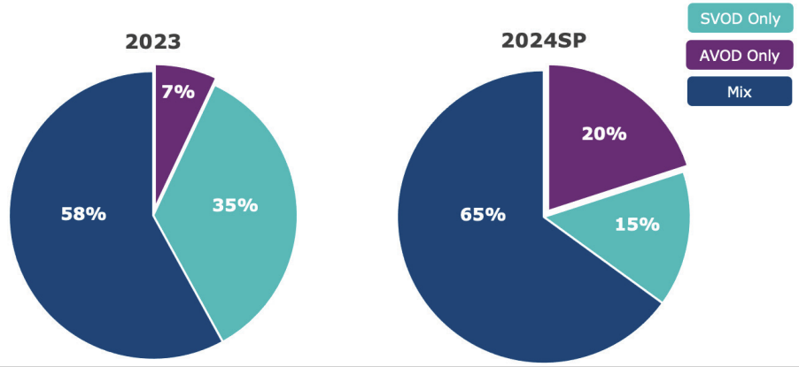
I mean, look at the DASH report chart below and you can see just how blurry the lines are becoming. Between its 2023 and spring 2024 studies, DASH found that the
SVOD (subscription video-on-demand, ie. premium streamers, etc.) declined from 35% of the pie to just 15%, while there was a corresponding jump in the shares going toward AVOD (ad-supported
video-on-demand) as well as a "mix."
Personally, I would have gone with ad-supported vs. pay, but I'm not sure the ARF -- even with years of DASH data -- knows how to estimate exactly that.
And if they do, why didn't they include it as an alternate way of segmenting the medium in the new framework?
I'm sure some of you will want to comment, explain and or speculate on the
resulting solution, so have at it.
Meanwhile, I'll just conclude with a quote from ARF Chief Research Officer Paul Donato, who is the chief architect on the whole project:
“As the
lines between traditional pay and streaming services continue to blur, we’re moving toward a new paradigm that will more accurately represent how households connect to television.”
