Commentary
Yahoo Livestand: What Would Steve Do?
- by Steve Smith , Staff Writer @popeyesm, November 3, 2011
 As kismet would have it, last night I was testing the new Yahoo Livestand content aggregation app just as the PBS documentary on Steve Jobs, “One
Last Thing,” was running. At one point, Black Eyed Peas member will.i.am extolls the magic of the iPad by saying that it is a high-tech, multi-function personal computer that has no instruction
manual, but anyone who picked it up already knew how to use it.
I looked down at this sluggish, overwrought Livestand thingie, whose functionality and navigational structure I was still trying to figure out at least a half hour into the experience, and literally said to my iPad screen, “No one is going to say that about you, are they?”
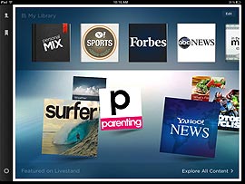
Somehow I feel transported to the world of Web portals circa 2002, where “personalization” really boils down to a small sliver of the experience that is dominated by favored content partners and the portal pushing its own content on me at every turn. Visually the app makes clear who is ruling the roost from the home screen, where the “Featured” partners occupy two thirds of the screen and a small book icon labeled “Personal Mix” gets an upper left corner. Anyone remember the early days of MyYahoo, when that page felt like an ongoing battle between Yahoo’s promotional imperatives and the “My” in the site title?
But things get even more complicated when you do try to customize things. At the start, Livestand asks you to designate content favorites from a modest selection of providers that end up in this Personal Mix book. The Mix opens up into a three-column layout where the lead story from each provider becomes a column of headlines, often with a thumbnail image. Empty columns invite you to add content, which one presumes will be tacked on to these scrolls.
Turns out it isn’t so simple. If you choose one of the Featured content partners as a favorite, then it appears at the same level as your Personal Mix book on the top rail of the “Library” interface, but non-Featured partners become “Bookmarks” in the Mix book.
So it took me all of five minutes of “customization” to create a home screen that had my eye going in multiple directions, having to figure out which content providers are embedded in my Personal Mix book and which get special treatment on the top rail Library. But these personalizations aren’t even dominating the Home screen. Instead we have a river of oversized but wholly uninformative media brand icons occupying two thirds of the screen. These icons aren’t even dynamically serving fresh headlines or anything that gives the reader value aside from the brand logo.
Yikes! This is worse than Pathfinder in 1996. At the start screen of this information aggregator, you are already a click removed from any actual information, and then you have to figure out in which of three directions to go, or who has fresh content you want to see. Is there something about the purpose of “aggregation” that is still unclear to Yahoo at this point in its corporate life?
Let me be fair. There are a lot of nice layout and navigational touches at work here. The Featured content does enjoy a richly illustrated tile treatment that is certainly more polished than what Flipboard or Zite offer their brand media partners. If you wonder where you are down the rabbit hole of content (and you will), there is an ever-present nav bar at left that will shortcut you to bookmarked sources. The slideshow narratives in some of the topic areas from Yahoo itself are excellent.
And to be sure, I have only been in the app for 90 minutes or so. You never know how something will grow on you. For the sake of comparison I have found over time that while Flipboard remains attractive for my nightly news crawls, Zite’s smart personalization and aggregation of tightly defined topic niches is more useful to me now.
Both of these aggregators genuinely embrace personalization in ways that Livestand clearly does not. To invoke the Jobs-ian principals of sleek design, high levels of integration and performance, and sheer simplicity, Livestand feels as heavy, cluttered, slow and partner-laden as, well, Yahoo.com or AOL a decade ago.


After spending a half hour with this app, I totally agree with your viewpoint.